The footer nobody designed

Quick commerce and ride apps leave two high-attention moments empty: the end of the home scroll and the wait for a delivery or ride.
This concept fills both with short games that upsell, earn ad revenue and make the wait easier.

Type
Self-initiated concept
Focus
Engagement, ad experience, upsell
Scope
Flows and UI

Not affiliated with any app named here.

The end of the home screen: the footer is now Hill Rider. Every rock is an ad slot.

Why I chose this

I kept noticing the same empty space

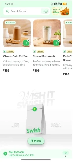
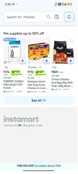
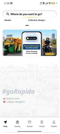
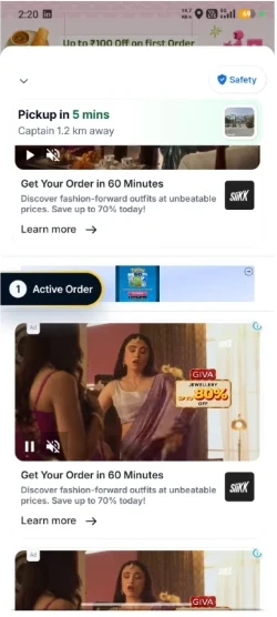
Zepto, Blinkit, Swish, Instamart and Rapido all end the home screen with a tagline and white space. Swish adds an illustration, but it's still recall. The wait screen just stacks ads.

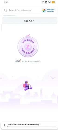
Zepto home footer: a Low prices, free delivery badge, FSSAI licence and a rider illustration
ZeptoBadge and illustration
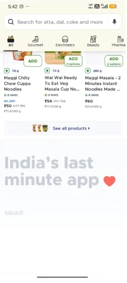
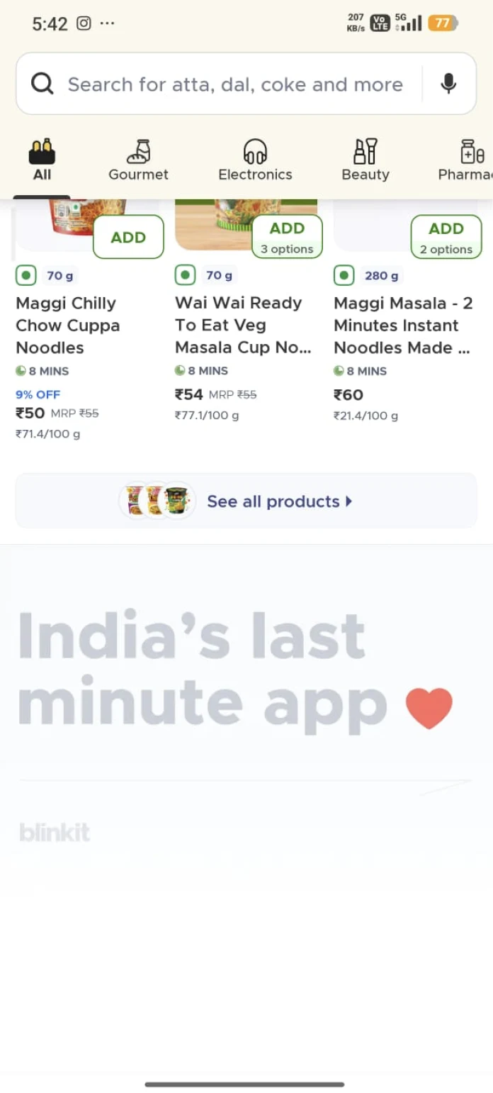
Blinkit home footer: India's last minute app, with a heart
BlinkitTagline only
Swish home footer: Wish it Swish it, with a Swish delivery bag illustration
SwishIllustration, still recall
Instamart home footer: instamart, Crafted with love in Bengaluru, India
InstamartTagline only
Rapido home footer: #goRapido, Made for India, Crafted in Bengaluru
RapidoTagline only
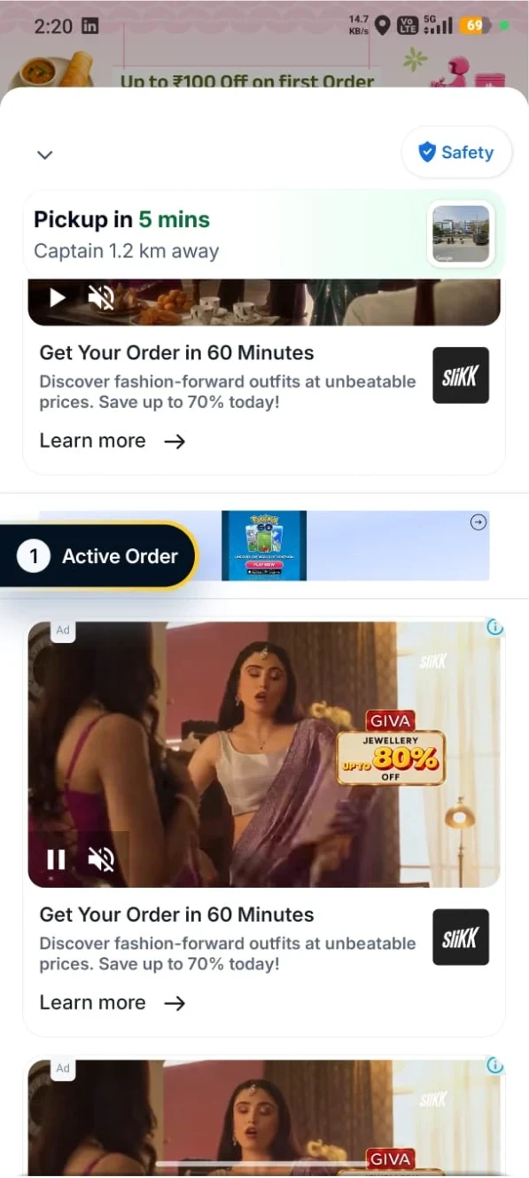
Rapido waiting screen: pickup in 5 minutes, then a stack of video ads for a jewellery brand
Rapido · the waitVideo ads, not tied to the wait

Problem identification

Two moments, nothing designed

Moment 1 · end of the scroll

Bored, and looking for a reason to buy

People who reach the footer are often browsing for leisure. They want a deal good enough to justify an order. The footer gives them nothing, so they leave for the next app.

Moment 2 · the wait

The ETA freezes, and nothing explains it

"10 min" grows or stalls with no reason shown. The map shows status, but not comfort. The ad banner stuck to it isn't tied to anything the user is doing.

  1. 01Footer: a wasted intent signal

    The user is at the end of the page with nothing to do.

  2. 02Wait: status without comfort

    The delay can't be explained, so the wait itself has to get better.

  3. 03Ads: attached, not integrated

    A banner next to a map gets ignored.

Blinkit home screen. The footer at the bottom reads India's last minute app, with a heart and the Blinkit logo
Footer · BlinkitA tagline and a logo. Nothing to do here.
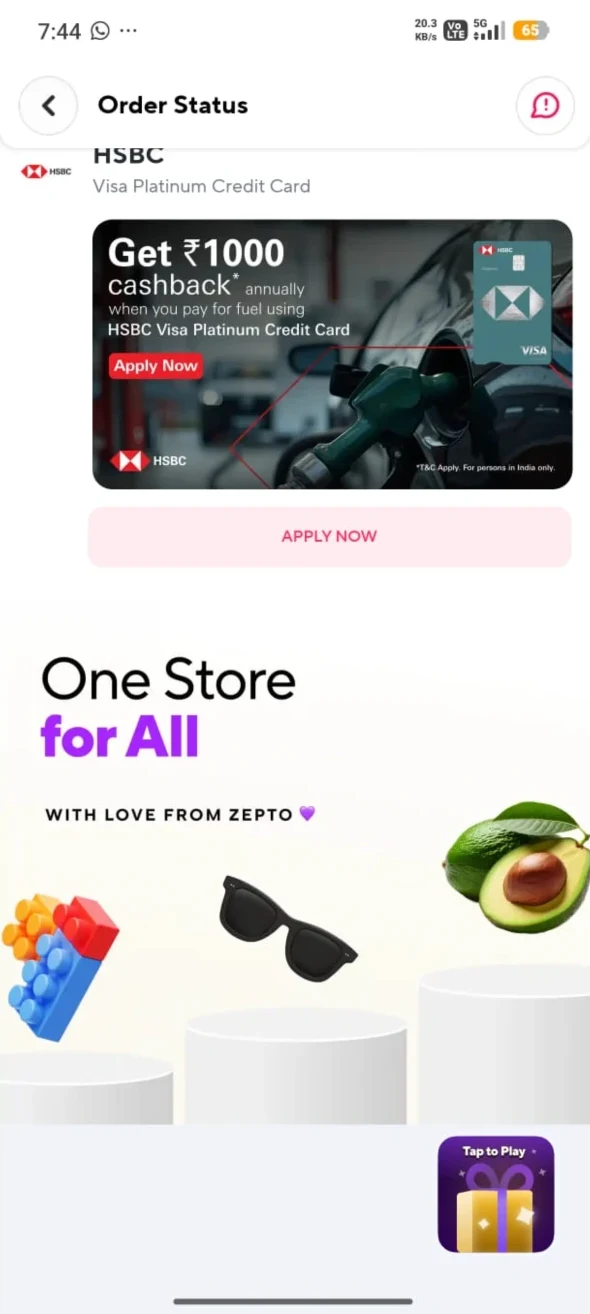
Zepto order status: an HSBC credit card ad, then a One Store for All footer with a small Tap to Play button
Wait · ZeptoThe order screen ends in a brand footer too. A small Tap to Play sits in the corner.
Rapido waiting screen: Pickup in 5 mins, then video ads for a fashion app and a jewellery brand
Ads · RapidoVideo ads stacked under the pickup card, unrelated to the wait.

Research and benchmarking

Footers are sign-offs, not features

Most quick commerce footers only say where the app was built. Swish adds a brand recall. On the delivery screen, ads sit below the first fold, under the map and order details, and often look stitched on.

WhereWhat's thereGap
Instamart, Zepto, Blinkit footersA line saying the app was built in BengaluruNothing to do
Swish footer"Wish it, Swish it" illustrationBrand recall only
Delivery screenAds below the first fold, under the map and order detailsAds look stitched on, not designed in

Design goals and constraints

Make both moments worth staying for

Goals / opportunities

  • A reason to stay at the footer
  • A wait people can tolerate
  • Ads people choose to touch
  • A deal that ends in the cart

Constraints

  • No real data on how the footer affects other metrics
  • No share of users who reach the footer, or conversion from it
  • Some products (food delivery) have infinite scroll and no footer
  • Switching to a sister app with an offer mid-delivery could feel like a hassle

Key design ideas and rationale

One space, many constructs

There are three main cases to optimise the footer for. Each fits a different kind of app. The games below are tagged by the case they serve.

Idle

End of the scroll

The user is browsing with nothing left to see. Give them a reason to buy.

SuitsInstamartSwishZeptoBlinkitAny app with a home footer
Wait

Delivery or ride on the way

The order is placed and the user waits for it to finish. Make the wait better and set up the next order.

SuitsZeptoBlinkitSwiggyRapidoAny app with ads or upsell during delivery
Cross-sell

Sister brands

Send users from one app to its sister app with an offer on something complementary.

SuitsSwiggy → ToingRapido → Ownly
WaitIdle

Hill Rider Ads showcasing game

A delivery rider crosses rocky hills, left to right, like Bike Mania or Dirt Bike to deliver the parcel. Every rock and billboard is a brand's ad. Cross a rock, unlock that brand's offer.

Ad slot
Rocks, billboards, collectibles, checkpoints
Reward
Brand offer per rock, voucher per checkpoint
Rationale
Ads sit in the path, so people see them while they play
WaitCross-sell

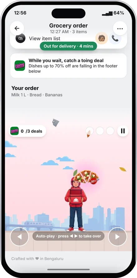
Sister-brand drops Cross-sell game on the delivery screen

The order is on its way. The map and ETA stay on top, pinned while you play. Below, the footer turns into the same catch game: dishes from toing, the sister app, fall with their deals. Catch one and claim it for later.

Ad slot
Sister-app dishes under the live map
Reward
A toing deal for after this order
Rationale
The wait gets a game, the ETA stays honest, and the sister app gets found
Cross-sellIdle

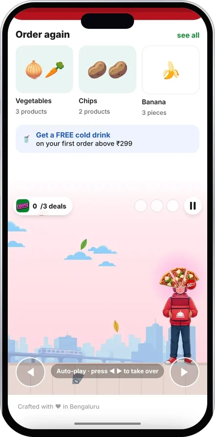
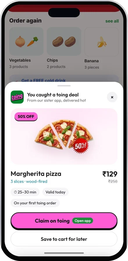
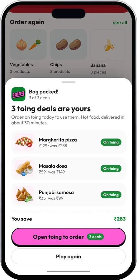
Pack the bag Cross-sell game

A courier stands under falling leaves and stones. Now and then a dish from toing, the sister app, falls with its deal on it. Catch it and claim it on toing. Three deals, or one stone, ends the round.

Ad slot
Sister-app dishes in the drop
Reward
Up to 70% off on toing
Rationale
Discovery and the deal happen together, across apps

How the ads pay

Ads in the path, not beside it

A banner is seen once and ignored. In Hill Rider, a brand is something you ride over, catch or unlock. That's four slots to sell, each priced by what the user did.

SlotWhat the user doesWhat the brand getsCharge by
BillboardRides past itBrand recallViews
RockRides over itAn offer seen in playCrossings
CollectibleCatches itA deal the user choseCatches
Checkpoint voucherReaches it, adds to cartA saleRedemptions

Three wins from one slot: ad revenue for the app, discovery for the brand, and a nudge on what the user was close to buying anyway.

Before vs after

Same space, a reason to stay

Footer Home screen, end of the scroll

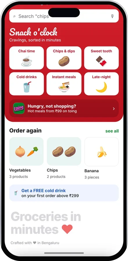
Before: the home screen ends in a pale tagline and white space
BeforeA tagline and white space
After: the footer opens into a catch game with a toing deal falling
AfterA game with deals in it

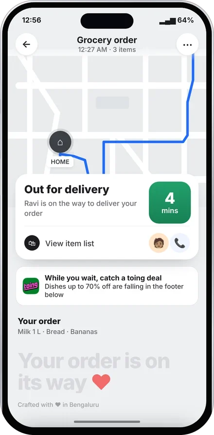
Wait Delivery tracking screen

Before: the tracking screen ends in a tagline under the delivery card
BeforeMap, ETA, then nothing
After: the ETA stays pinned at the top while the footer plays the catch game
AfterETA pinned, the wait is playable

What I'd validate, and where it could go wrong

No testing yet, so these are open questions

Measure

  1. Do people start the game, and come back tomorrow?
  2. Does it convert better than today's footer and banner?
  3. What does a free item cost per order?
  4. Do brands pay more for a crossing than a view?

Honest limits

  1. It could annoy someone on a late order, so the ETA stays pinned and the game is skippable.
  2. It nudges people to buy, so one play a day.
  3. It's only as good as the deals behind it.

Final prototype

Play it

Hill Rider · liveHome footer to ride; rocks unlock brand deals
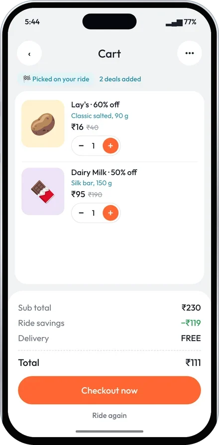
Hill Rider end screen: a cart with the deals picked on the ride, savings and checkout
Hill Rider · cartOnly the deals you added
Pack the bag · liveCatch toing dishes, dodge stones
Bottom sheet: a caught toing deal with Claim on toing and Save to cart for later
Claim sheetClaim on toing, or save for later
Round summary: three toing deals claimed, total saved and Open toing to order
Round summaryThree deals, one tap to toing
Sister-brand drops · liveSame game on the tracking screen, ETA pinned

Reflections

An empty screen is still a decision

  1. Empty space can still work for the product

    A non-interactive part of the screen, like the footer, can do something for the product and the business.

  2. Annoying can become enjoyable

    Ads and upselling annoy users. Made into play, they become something people enjoy, and that helps the business.